
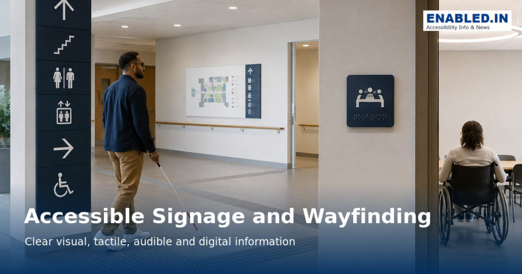
Accessible wayfinding helps people understand where they are, choose a route and confirm they have arrived.
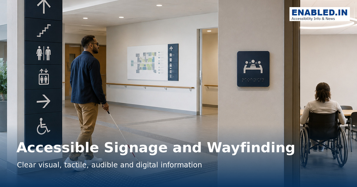
No single sign works for everyone. An inclusive system combines consistent visual information, tactile and braille identification, audible or human assistance and accessible digital directions.
Global-standard note: Selected one national reference dimensions are shown as practical examples. Confirm the adopted accessibility, building and fire rules for your location before design or construction.
Measurements at a glance
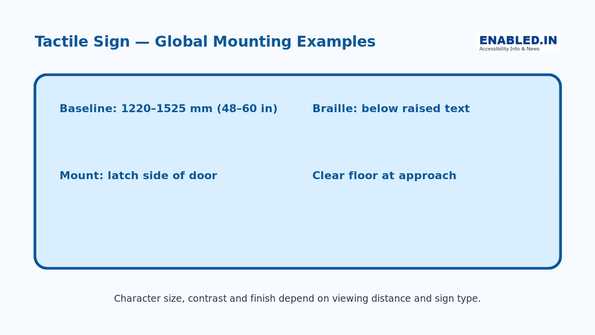
Global Summary – Accessible Signage & Wayfinding
| Element | Global planning recommendation | Notes |
|---|---|---|
| Tactile sign height | 1200–1600 mm above finished floor | Use as a broad global planning range. Exact tactile-character height and measurement point vary by jurisdiction. |
| Preferred consistent tactile zone | Approx. 1200–1500 mm | Helps keep tactile/Braille information within comfortable standing and wheelchair reach. |
| Door identification sign | Latch/handle side of doorway | Good general location where required; avoid placing identification information on the moving door unless the applicable standard permits it. |
| Braille position | Directly below corresponding raised text | Keep Braille associated with the same information and provide adequate separation. |
| Raised/tactile characters | Provide where identification requires tactile reading | Character dimensions, relief and spacing must follow the applicable national standard. |
| Approach space | Clear, unobstructed approach required | A wheelchair user should be able to approach and read or touch the sign safely. They should not encounter an unsafe door swing or circulation conflict. |
| Visual signs | High contrast, legible, non-glare | Use clear typography, appropriate character sizing and sufficient contrast for the viewing distance. |
| Directional information | Consistent symbols, arrows and terminology | Maintain the same wayfinding logic throughout the facility. |
| Audible information | Provide an accessible alternative where appropriate | Particularly useful for complex transport, public and dynamic environments. |
| Digital wayfinding | WCAG-conformant and multimodal | Digital maps/kiosks should support keyboard, screen readers, zoom/reflow and accessible alternatives to visual-only directions. |
Tactile Sign – Global Planning Guidance
Tactile zone:
1200–1600 mm AFF*
Keep height consistent
Braille:
Below corresponding raised text
Location:
Latch/handle side of doorway*
Approach:
Clear, unobstructed access
AFF = Above Finished Floor. Exact mounting height, measurement point and door-location requirements vary by jurisdiction. Verify applicable national and local standards.
This approach is much safer. It avoids stating “Baseline: 1220–1525 mm (48–60 in)” under a heading containing “Global.”
Build a consistent information hierarchy
Start with orientation at arrival, then decision-point directions, room identification and destination confirmation. Use the same names, symbols, colours and numbering across signs, websites, maps and staff instructions.
Make visual information easy to read
Use strong light–dark contrast, non-glare finishes, simple typefaces, adequate character size and short messages. Mount signs where people can approach without blocking circulation, and light them evenly without reflections.
Provide tactile characters and braille correctly
Permanent room and space signs generally require raised characters and braille under the one national reference. Mount tactile signs beside the door on the latch side where feasible. Ensure the raised-character baselines are between 1220 and 1525 mm (48–60 in) above the floor.
Design for blind and low-vision navigation
Keep cane-detectable edges, landmarks and routes predictable. Add tactile maps only when they can be understood and maintained. Audible beacons or accessible mobile navigation can supplement—not replace—clear physical wayfinding.
Test with users in realistic conditions
Review signs from seated and standing positions, at expected approach distances and under day and night lighting. Test with blind, low-vision, Deaf, hard-of-hearing and cognitively diverse users before final production.
Easy inspection checklist
- Destination names are consistent across every channel.
- Signs use high contrast, matte finishes and readable typography.
- Permanent-room signs include correct tactile text and braille.
- Tactile signs are placed consistently beside doors.
- Maps include accessible routes, lifts, toilets and exits.
- Temporary signs meet the same readability principles.
Frequently asked questions
Does every sign need braille?
No. Under the one national reference, tactile and braille requirements generally apply to signs identifying permanent rooms and spaces. Directional and informational signs have visual requirements. Check the precise sign type and local standard.
Where should a tactile door sign be mounted?
The one national reference generally places it on the latch side of the door. It offers detailed alternatives for double doors. There are also options for locations lacking wall space.
Can colour alone communicate a route?
No. Combine colour with words, shapes, symbols, or tactile information. Use other cues so people who cannot distinguish the colour still receive the message.
Standards and further reading
- U.S. Access Board – Signs
- U.S. Access Board – Guide to the ADA Accessibility Standards
- UK Government – Approved Document M
- ISO 21542:2021 – Accessibility and usability of the built environment
This educational guide does not replace professional advice or the requirements of the authority having jurisdiction.
Discover more from enabled.in
Subscribe to get the latest posts sent to your email.